Posts

Showing posts from December, 2015

Professinal Article Review

Image
Creative Anarchy at Its Very Best by: Denise Bosler is about rules. That sounds boring but the article is about how you can break or bend the rules to create a design. Designs don’t always have to be exactly what the client wants, you can think outside the box to get even bigger ideas. Bosler’s main focus in the article is rules and also a creative anarchy.  Creative Anarchy is about pushing not only your own boundaries and expectations, but those of the client as well. This article really connected with me because I don't like to follow the rules in graphic design sometimes. I like to go all willy nilly on some projects that I don't know how to create. Or if I'm just trying to get some ideas out then I will go all willy nilly. 
Personal Logo

Image
This is my personal logo and some of my typefaces. For my logo I used the star shape tool but I added more sides to it. I then used the pathfinder tool to make the star shape different. I separated the outsides so there is a space between the shape and the sides. Once I finished creating my shape I added my initials in the middle of my shape. For my typefaces I wrote out my name but then I made on big R since I have an R in both of my names. One typeface what I did was combine my I and K together. What I did to my other typeface was tilt my S's then combine them.

Mountain Photoshop

Image
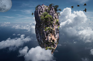
In Photoshop we took a picture of a montain and made it look like it was floating in the sky. Before you could transfer the floating mountain to the sky I had to remove it from the image and place it on its own layer uing the quick selection tool. After I quick selected it I moved it to its own layer and with the refine edge button I made it look like the regular mountain. After that was done I had to get rid of the waterline at the bottom of the mountain. To make this happen I used the lasso tool and took a piece out of the mountain and moved it down to the bottom of the mountain. Then I took the mountain and warped it so it was kinda pointed at the bottom. Once the mountain was finally complete I then moved it into the sky. Once in the sky I moved one of the clouds infront if the mountain so it actually looked like it was floating. After I completely finished the mountain in the sky I added some elements to my floating mountain. I added the moon in the top left corner of the image.

Patterns

Image
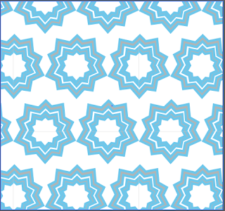
This is one of the patterns that I made in Adobe Illustrator. This is my repeating pattern because it repeats itself. To make this pattern I took the star tool and used the up arrow to create more sides or points on the shape. Once I had the shape in the position I wanted I just copied and pasted it  while making the shape smaller after each pasting. Once my pattern was completed I made it repeat itself. My next pattern is the radial pattern. It's called a radial pattern because it radiates from the center point out. I also used the star tool to make this shape but I added a lot of points. I also used the pathfinder tool to create some pieces together so it looks more like a flower. I then copied and paste it down and after every other shape I changed the color from blue to white. 

Masks

Image
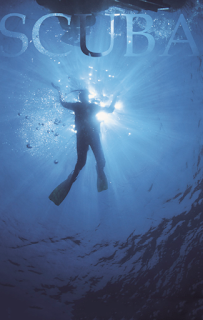
The first mask that I made in Photoshop was the layer mask. The layer mask was really simple and easy to make. I used a picture of someone scuba diving then I typed in the word Scuba on a different layer. I then made it look like the word scuba transparent. This mask was easy to make and if I ever want to have words be transparent for like a poster I can use what I learned when making this. The next mask that I created in Photoshop was the Blur mask. I was given a picture of a kid on a swing and I used the blur effect to make it look like the kid is swinging. I can use this mask type for anything that would look like it was in motion for example a car or a person doing a certain activity. The last mask that I made was the clipping mask. The word I used was KAMFAM which is what fans of a duo Kalin and Myles are called. I had to type each letter of KAMFAM out on each of it's own layer. I then took an image of Kalin and/or Myles and put it over the image. After the imag

Shadow

Image
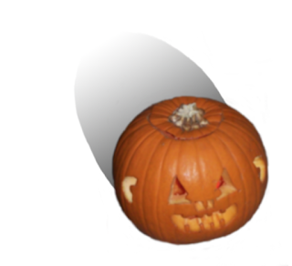
For the shadow project I created this in Adobe Photoshop. We had to take an object an create a shadow with it. I chose to create a shadow for a pumpkin. I first had to find an image of a project and since the image I found had more things then I needed I took it into Photoshop and removed the background with the mask tool. Once that was finished, I started to make the shadow of the object. I used the gradient tool and had the image go from black to white for the shadow. In this project I learned how to make a shadow and I leaned how to use the gradient tool better.

Painting in Phtoshop

Image
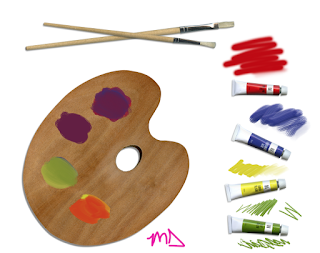
 To make this color palette I was given the image which had the palette, the brushes, and the tubes of paint. I used the mixer brush to make it look like the palette was colored on and that the tubes of paint were tested out. I first had to get the eye dropper tool and take a sample of the red paint then I used the mixer brush to paint above the red paint tube. After the red pain tube I moved onto the blue paint tube. I did the same thing with each paint tube but I used a different type of brush on each tube of paint. After all the tubes of paint were finished I moved onto the paint palette. I took a sample of the red paint and colored in the first part of the palette and I continued doing this for all around the palette using different colors. With the color palette I learned how to use the mixer brush tool I also learned that the different brushes can be used for different jobs with different styles. I also had to paint an orgianl picture in photoshop. The photo I chose was wh